Tuesday, June 5, 2012
Thursday, May 31, 2012
Sunday, May 20, 2012
Saturday, May 12, 2012
Wednesday, May 2, 2012
Thursday, April 26, 2012
Checkpoint 3
A web site may be very good at stating its aims but if it does not do what it says it will then it will be of little use to you. Try looking at one page of a web site. Read through the information and then decide whether it has really told you what it said it would. Are there any diagrams or pictures to illustrate what is being said? Do these help you to understand it?
These two example web sites both aim to tell you how to cure hiccups.
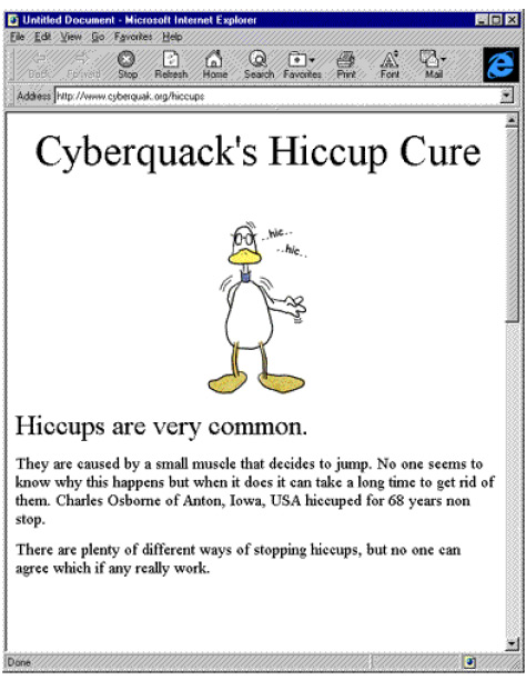 This web site doesn't really achieve the aim because it tells you about hiccups but not how to get rid of them.
Web site 2:
These two example web sites both aim to tell you how to cure hiccups.
Have a look at each one and think about the aims.
Web site 1:
Web site 2:

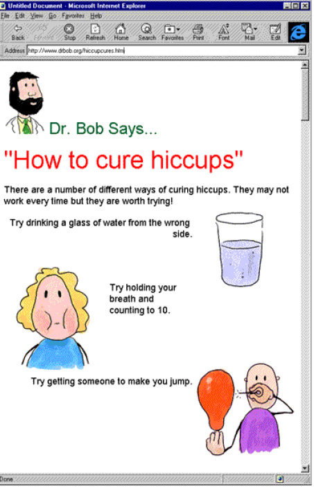
This site gives you some ways of curing hiccups. So it does achieve the aim. If a site does not do what it says it will then it will be of little use to you
Tuesday, April 24, 2012
Internet Searching For Dummies
 Are you a newbie to the internet? Don't know how to search for things you want to look at? Well then you're in luck because this is what this whole guide is about. Now to get started, the following websites are the best for searching:
- Yahoo!
- Bing
- Don't use common words such as: the, a, in, have, etc...Searching Engines will usually ignore them.
- Try to be as specific as possible. Don't make your searches too general.
- If you have a group of words, adding ' ' to them will group them together.
- If you want the search engine not to include a word in its search, just add a - before the word.
- If you want the search engine to include a word, simply add a + before the word.
Sunday, April 22, 2012
Bizzare Facts
- Did you know...Being unmarried can shorten a man's life by ten years.
- Did you know...A headache may be reduced by eating 20 tacos.
-
Did you know...A barnacle has the largest penis of any other animal in relation to its size.
Did you know... After the death of the genius, Albert Einstein, his brain was removed by a pathologist and put in a jar for future study.
Wednesday, April 18, 2012
Thursday, April 12, 2012
Wednesday, April 11, 2012
Pet Shop Logo
Tuesday, April 3, 2012
Design Characteristics
This is a business card I made of myself. Here are the things I did:
1) I added a picture of me wearing a tuxedo.
 2) I changed the colors to blue to represent AIS.
3) I added the AIS logo.
4) I added some other random information.
Here I made a brochure of the upcoming Sport Day. Here are the things I did to it:
1) I changed the background to a picture of grass to inform others that the sports will be played on grass.
2) I changed the color to different shades of green to make it suit the grass background.
3) I added some pictures of the sports.
4) Finally, I added some random information.
1) I added a picture of me wearing a tuxedo.
 2) I changed the colors to blue to represent AIS.
3) I added the AIS logo.
4) I added some other random information.
Here I made a brochure of the upcoming Sport Day. Here are the things I did to it:
1) I changed the background to a picture of grass to inform others that the sports will be played on grass.
2) I changed the color to different shades of green to make it suit the grass background.
3) I added some pictures of the sports.
4) Finally, I added some random information.
Monday, March 19, 2012
Examples of Good and Bad Logos
Here an example of a good logo:
Reasons:
- It is simple.
- It represents the company.
- It also shows a galaxy shape, representing the galaxy mobiles.
Reasons:
- It has words in the middle of the picture, making hard to read.
- It doesn't look appealing.
- It looks more of a circus poster rather than a bike store poster.
Thursday, March 15, 2012
Recommened Changes To Bad Presenations
- Rule 1: Try to keep as simple as possible
- Rule 2: Make sure the design is consistent
- Rule 3: Make sure your audience understands it
- Rule 4: Add a few images for your audience to understand a little more
- Rule 5: Try to make it as interesting as possible
- Rule 6: Always consider your audience, whether it's young or old
Using Paint.NET
In this picture, I made 5 layers: the Earth, the Lamborghini, the Stickman and the textbox. I edited each layer and combined them all.
Wednesday, March 7, 2012
Project 1 Review: Multimedia Presentaion
Here's a screenshot of one of the slides in my science presentation. The things I learned or changed throughout this project are written in the text boxes.
This is the video I used for my science presentation. Some of the changes I made are:
- I cut out unnecessary parts because I don't want my audience to sit through long and random parts.
- I brightened the video up since it was so dark and make it easier to see what's going on in the video.
- I added subtitles to give additional details so that the adults could understand it better.
Tuesday, February 28, 2012
Sunday, February 19, 2012
Editing Bitmap Images

I cropped the image and resized it to 400 pixels so that the people can focus on the frog and not see all of the unnecessary things.


I darkened the image so that it not too bright and look as if you can fry an egg on your head in there.

I darkened the image again so that it won't look like you can fry bacon in there.


I brightened the image so that it doesn't look like it's the end of the world.


I removed the red-eye from the bunny so that it won't be turning into a Devil Bunny and start scaring people.
Wednesday, February 15, 2012
Changes made to Presentation
Some if the changes I made to the slide are:
- I inserted an image instead of a cartoon because adults don't really like cartoons.
- I tried to make the information as detailed as possible because adults usually only look for the information.
- I made the layout as simple as possible to make it look professional since adults like professional looks.
Tuesday, February 14, 2012
Sunday, February 5, 2012
Wednesday, February 1, 2012
My Targets in ICT
I'm Tommy and I'm 11 years old. My hobbies are to play video games and hanging out with my friends. I currently study at the AIS Middle School in Ho Chi Minh City. My main target this semester in ICT is to improve my graphic design skills by learning how to use Photoshop, Paint.NET and other graphic design software.
Subscribe to:
Posts (Atom)


